About Project
Mix - Data Entry module (Support application for Medintelx )
Mix is a Redesign project with few new requirements. This is a support web application for medintelx. Medintelx is a web application where patients insurance claims will be validated In Mix, user has option to select a particular claim id and edit the claim.
User Research:
Target Audience:
- Medical Coders, Healthcare Providers (Doctors), Insurance Auditors, Compliance Officers
- Typical Age Range: 25–55 years
- Tech-savvy professionals with specialized knowledge, moderate to high computer literacy, and a focus on productivity, compliance, and accuracy.
User Interview:
Target Audience:
- Total Users Interviewed: 9
- User Roles: Medical Coders: 8, HIM Manager: 1
- Interview Duration: 30–45 minutes per user
- Interview Method: Remote (via Zoom) and In-person
User Interview Insights:
- "It’s hard to view the full PDF clearly while working."
Users struggle with limited space to view PDFs, such as scanned charts or clinical documents. This forces them to scroll or zoom constantly, interrupting workflow.
- "Reading through the content feels tiring and straining on the eyes."
Poor font choice, layout, or visual hierarchy is affecting readability. Users may have to put in extra effort to extract key information, especially when under time pressure.
- "There’s just too much on the screen — I don’t know where to look first."
Users feel overwhelmed by excess or irrelevant information, which distracts them from their main task — accurate and fast medical coding.
- "The layout looks messy — some buttons and fields don’t line up right."
Users perceive the UI as unpolished or inconsistent. Misaligned elements reduce trust in the system and increase cognitive load when navigating.
Problems:
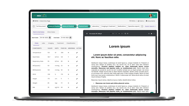
- Pdf visibility is low due to less space occupation.
- Readability problem.
- A lot of unnecessary information distracts from the primary task flow.
- Looks like ui elements are not aligned properly.
Solutions:
- Implemented Dark mode for the users who were comfortable to work on the application in USA hours.
- Implemented FAQ’s.
- Implemented onboarding tool tips.
- Updated the new ui style guide.
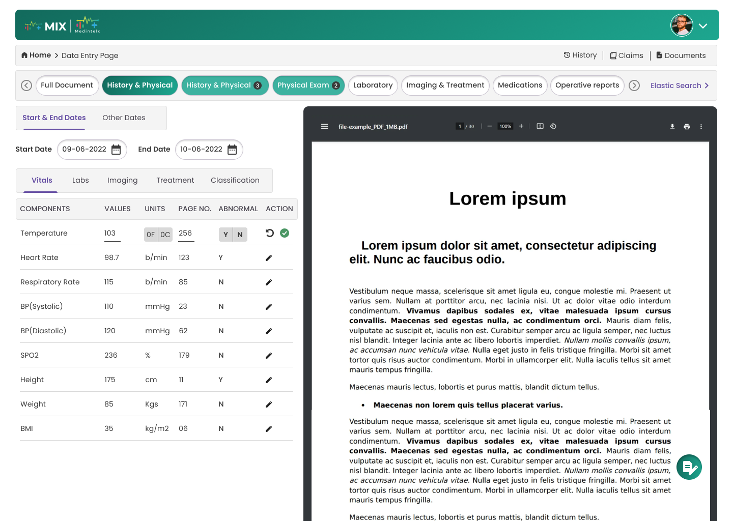
- For pdf visibility, assigned 65% of whole width to pdf section.
- Replaced the font-family, which is related to this category and has more readability.
User Persona:
User Flow:
Information Architecture:
Design System:
Typography: Poppins
Poppins has a geometric, minimalist style that aligns with the clean, professional look expected in healthcare interfaces. Poppins is a web-safe, Google Font with strong rendering support across browsers and screen sizes, ensuring consistent appearance. With its wide range of weights (from Thin to Extra Bold), Poppins makes it easy to create clear typographic hierarchy for headings, subheadings, labels, and body text.
Colour scheme:
Primary colour: Linear gradient(#126A5C, #1DA68F)
Text colour: #393939
Dark grey for clean, readable body text
Link colour: #6750A4
Imaginary:
High Fidelity Wireframes:
Prototype Link:
https://www.figma.com/design/pkm58KCKI4bWxV4L4FXQBy/Medintelx?node-id=1-232&t=1fp2JtsuZRIrMkvg-1
Login screen
Homepage
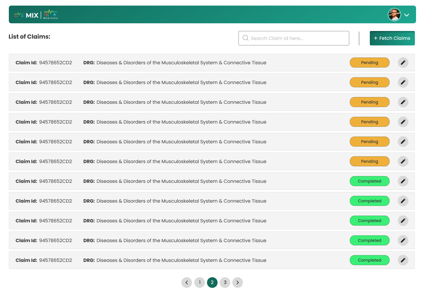
Dashboard

Dashbaord Component Edit Screen
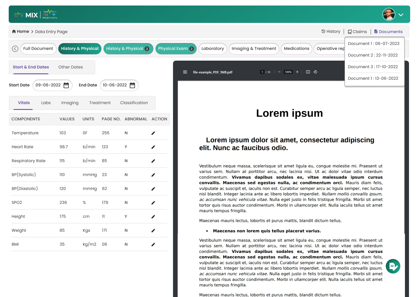
Dashboard History
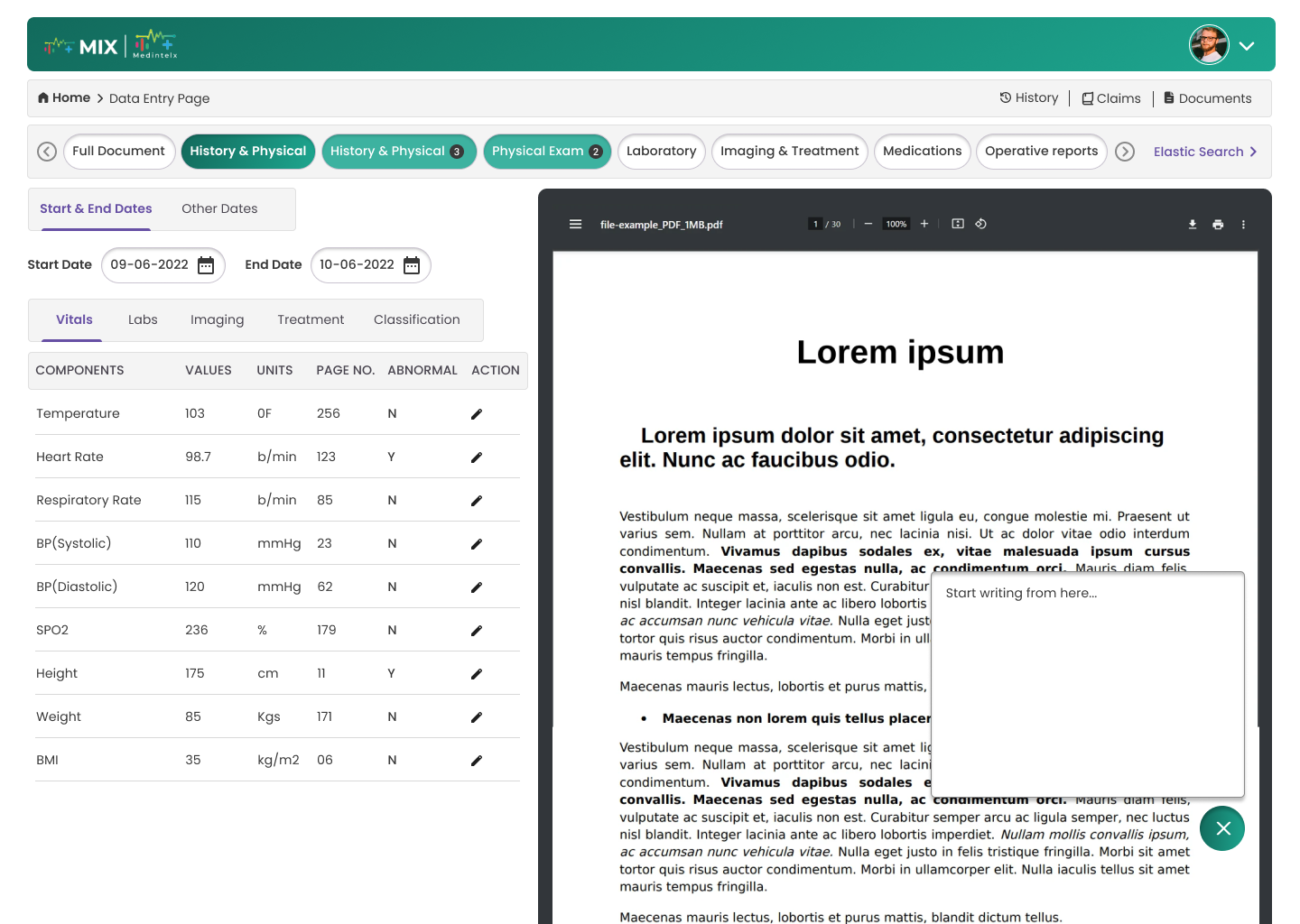
Dashbaord Personalised Notes
Usability Testing: I found few issues while testing this prototype with users:
- Get claim button is looking like related to search input. One of the user confused and entered claim id in search input and clicked on get claim button.
Solution: I have changed the name to Fetch claims from Get claims and given a divider between them.
Results:
- Task completion rate improved by approximately 36.4%.
Reduced data entry time per parameter by 36.4%, significantly accelerating task completion during health record audits.


Understanding WCAG 2.1: Enhancing Web Access...
Heuristic Evaluation for Better UI/UX Design...
The Art of Minimalism...